Adam green – dance with me
(17 sec intro)
Heart and soul Baby (1 second)
There's no goal (1 second)
Turn the lights on bright (1 second)
You're a rock and roll star
4 sec space
Feel my love (1 second)
Coming from the heavens above (1 second)
When my eyes meet your eyes (1 second)
You know it's true
3 sec space
Chorus:
Baby come dance with me (1 second)
Baby come dance with me-ee (1 second)
On TV at the TV station
2 sec space
Baby come dance with me (1 second)
Baby come dance with me-ee (1 second)
On TV at the TV station
3 sec space
You are lost (1 second)
And I'm at home (1 second)
And nobody wants to be here alone
3 sec space
Ooo babies in mint condition (1 second)
Man I'm doin' some dirty wishin' (1 second)
Let's both get on that rocket to the stars
2 sec space
Baby come dance with me (1 second)
Baby come dance with me-ee (1 second)
On TV at the TV station
2 sec space
Baby come dance with me (1 second)
Baby come dance with me-ee (1 second)
On TV at the TV station
25 sec space
(Repeat until fade)
Thursday, 30 September 2010
Monday, 20 September 2010
advert analysis

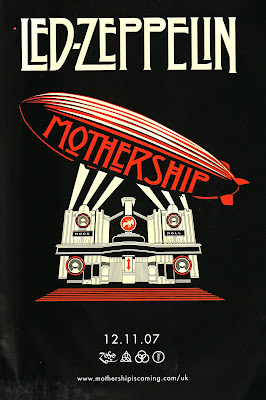
The album advert i have chosen to do is Led Zepplins - motherhip (or greatest hits. the images used in this advert is an image of a plimp hovering over a thearte with spotlights on it. The colour scheme involved is black, white and red. this colour scheme has black and white in it, this makes the advert look old fashioned, like from the era from when then band formed and the red represents the bands new, remastered songs.
the poster has a strange font with some of the letter, only for the name of the band and album title as well. the band name is at the top of the poster in a white and the album title is on the side of the plimp in red. have the text on the side of the plimp could represent the bands status in popular music. the bands name is a bigger size than the album name, representing the band is bigger than the album. The poster has four symbols postitioned at the bottom of the poster. the four symbols represent each member of the band.
Sunday, 19 September 2010
Digipak Analysis


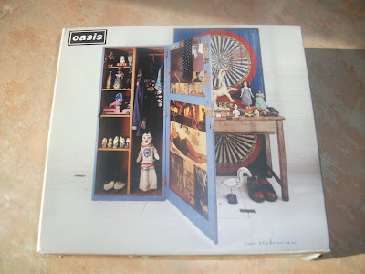
The digipak I have chosen is Oasis's, Stop the Clock album which is also there greatest hits. On the front cover of the digipak there are four images, the first image is at the top left and it is an image of the bands name, in the case Oasis, this image is of the bands logo, which is there name in a white font and a black background. This is helping the audience identify the digipaks content. Another image on the font cover is a wooden wardrobe, inside are toys and clothing such as Elvis figures, snow white and the seven dwarves ornaments, an Elvis jacket and other vintage objects. The designer was Sir Peter Blake, who also designed the Beatles cover for Sgt. Pepper and the Lonely Hearts Club Band. The third image on the front cover is of a door with a blue background, painted on it is CD 1 inside the digipak painted twice. The last image is of a wooden table with objects on top of it and beneath it. These objects are a similar style to the ones inside the wardrobe, which are old, worn out toys which are from the 1940's till 1960's. All of these images and objects create an age to the album, making the album feel and look like it’s not from this time, probably the reason the band named the album "stop the clocks".
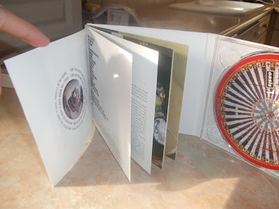
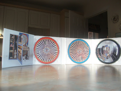
inside, the digipak has four spaces, the first is a small book featuring images of the band in different years, song titles and the lyrics to the songs and a small history about the band. the second and third place in the digipak is the two main CD's featuring all the songs, on CD1 it is an old fashioned roulette wheel with a red ring around the outside. CD 2 is the same to CD 1, but has a blue ring around it. the fourth place is a DVD about the band and is titled "Big Brother". the CD has a image of the front cover but at a different angle.
Saturday, 18 September 2010
audience profile
My artist is called Adam Green; his genre of music is called indie rock. Indie rock became mainstream in the late 2000's, with band such as kings of Leon, arcade fire and vampire weekend.
The general audience for indie rock is males and females aged 14 - 30 years old. This is because indie rock is a fairly modern genre of music, this means older generations of people won't be used to it and prefer there generations sounds of music.
In an indie rock music video the stereotypical mise en scene the audience is likely to see is a rundown warehouse like kings of Leon - sex is on fire. Or just inside a basic studio performing in an entertaining scenario’s such as Vampire weekend - A punk and Arctic Monkey's - I bet you look good on the dance floor. These styles of videos give the songs a basic and simplistic atmosphere to it.
Thursday, 9 September 2010
shot count task
Faithless - Mass Destruction
In this video there were approx. 112 shots used and 88 meat shots used.
The video lasted for 3 minutes and 35 seconds
In this video there were approx. 112 shots used and 88 meat shots used.
The video lasted for 3 minutes and 35 seconds
Subscribe to:
Comments (Atom)