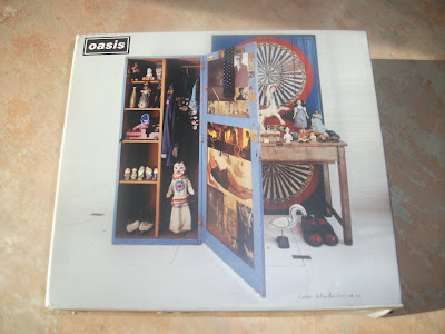


The digipak I have chosen is Oasis's, Stop the Clock album which is also there greatest hits. On the front cover of the digipak there are four images, the first image is at the top left and it is an image of the bands name, in the case Oasis, this image is of the bands logo, which is there name in a white font and a black background. This is helping the audience identify the digipaks content. Another image on the font cover is a wooden wardrobe, inside are toys and clothing such as Elvis figures, snow white and the seven dwarves ornaments, an Elvis jacket and other vintage objects. The designer was Sir Peter Blake, who also designed the Beatles cover for Sgt. Pepper and the Lonely Hearts Club Band. The third image on the front cover is of a door with a blue background, painted on it is CD 1 inside the digipak painted twice. The last image is of a wooden table with objects on top of it and beneath it. These objects are a similar style to the ones inside the wardrobe, which are old, worn out toys which are from the 1940's till 1960's. All of these images and objects create an age to the album, making the album feel and look like it’s not from this time, probably the reason the band named the album "stop the clocks".
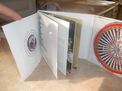
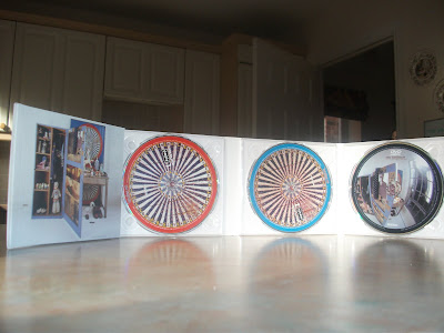
inside, the digipak has four spaces, the first is a small book featuring images of the band in different years, song titles and the lyrics to the songs and a small history about the band. the second and third place in the digipak is the two main CD's featuring all the songs, on CD1 it is an old fashioned roulette wheel with a red ring around the outside. CD 2 is the same to CD 1, but has a blue ring around it. the fourth place is a DVD about the band and is titled "Big Brother". the CD has a image of the front cover but at a different angle.
No comments:
Post a Comment