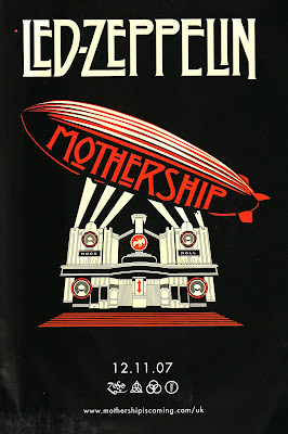
The album advert i have chosen to do is Led Zepplins - motherhip (or greatest hits. the images used in this advert is an image of a plimp hovering over a thearte with spotlights on it. The colour scheme involved is black, white and red. this colour scheme has black and white in it, this makes the advert look old fashioned, like from the era from when then band formed and the red represents the bands new, remastered songs.
the poster has a strange font with some of the letter, only for the name of the band and album title as well. the band name is at the top of the poster in a white and the album title is on the side of the plimp in red. have the text on the side of the plimp could represent the bands status in popular music. the bands name is a bigger size than the album name, representing the band is bigger than the album. The poster has four symbols postitioned at the bottom of the poster. the four symbols represent each member of the band.
No comments:
Post a Comment